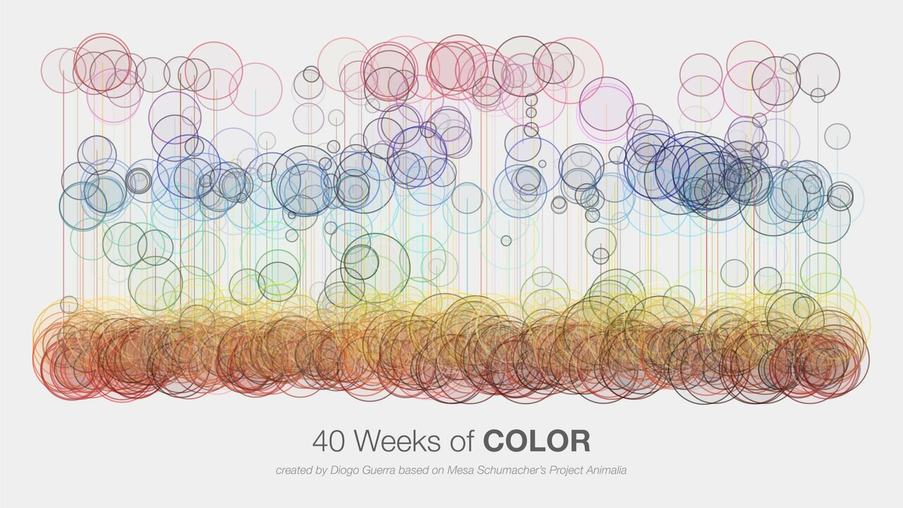
/ Visualizing 40 Weeks of #Color palettes based on @mesabree's project Animalia A more conceptual #data driven #art created in @f_l_o_u_r_i_s_h – x axis for time, y axis for hue, and bubble size for saturation. Enjoy! #dataviz #sciart #datascience #scicomm #infoviz #graphics https://t.co/GZNSqUSr5E